Creating Efficiencies And Increasing Visibility Into Program Success
My employer, SmartStory Technologies, provides digital healthcare tools to a companies that are looking to improve patient engagement. So how do these companies know that these tools have been successful in making a difference?
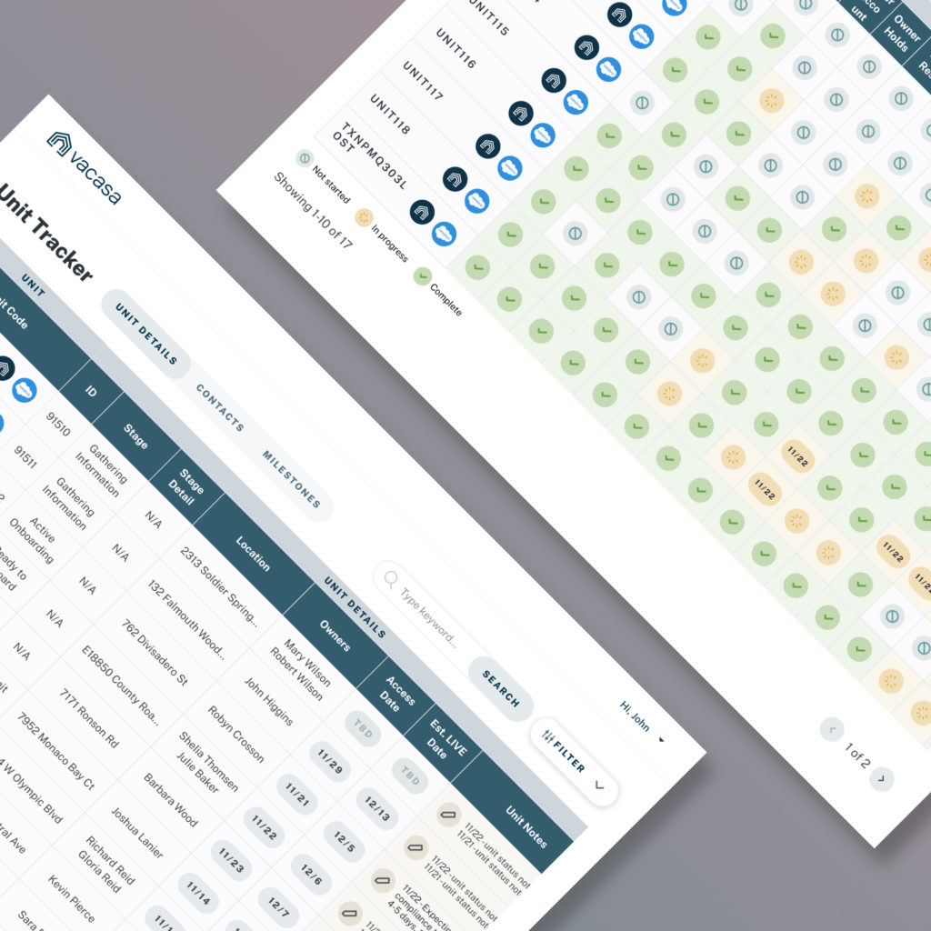
In the past, we provided monthly reports to these customers in CSV format. Producing these reports was time consuming for our internal team and the data was a lot for the customer to take in.
SmartStory wanted to produce a dashboard that customers could login and view at any time to get a snapshot of the health of their programs.
My Role
Collect requirements from customers, understanding their priorities for data visualization
Ideate on the best ways to visualize available data
Produce high fidelity mockup and functional requirements for development team
Monitor usage and collect user feedback
customer
Step 1
Understand Stakeholders
My first step was to meet with stakeholders to understand what data was available and how this data helped them to evaluate the success of their initiatives. Three types of users stood out during this process and each of them would be using the dashboard differently.
Primary Contact
Director level position at healthcare company and directly responsible for SmartStory tools and associated patient engagement initiatives. This person wants a way to quickly see the health of their programs, key performance indicators, and opportunities for improvements. They will be viewing this dashboard weekly.
Senior leadership
C-suite position who the primary contact reports to. This person will only be viewing the dashboard briefly during quarterly or annual reviews with the primary contact. They want to quickly see the health of the tools and initiatives for budget and decision making purposes.
Account Manager
This person is the internal resource at SmartStory that previously produced monthly reports for customers and will benefit from this process being automated. They want to make sure that the customer has the information they need and that SmartStory has enough information to ensure the success of the products and services they offer as a company.
Step 2
Define Requirements
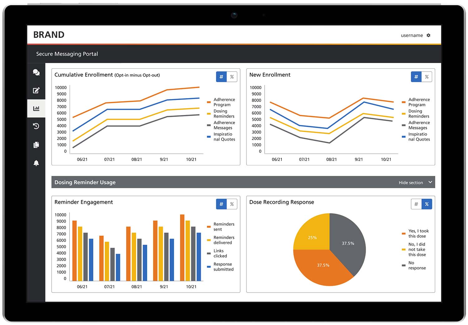
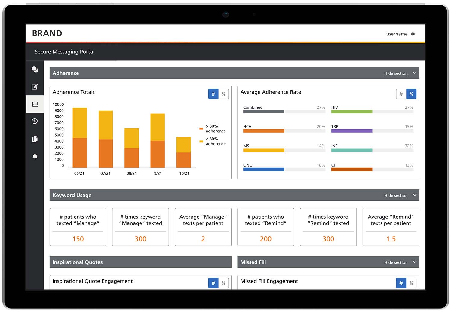
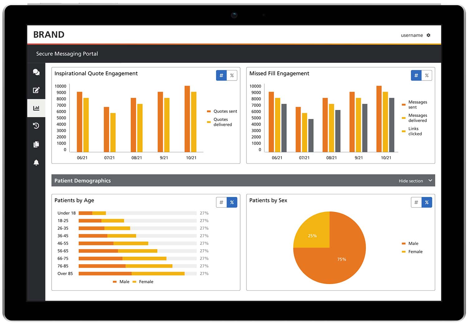
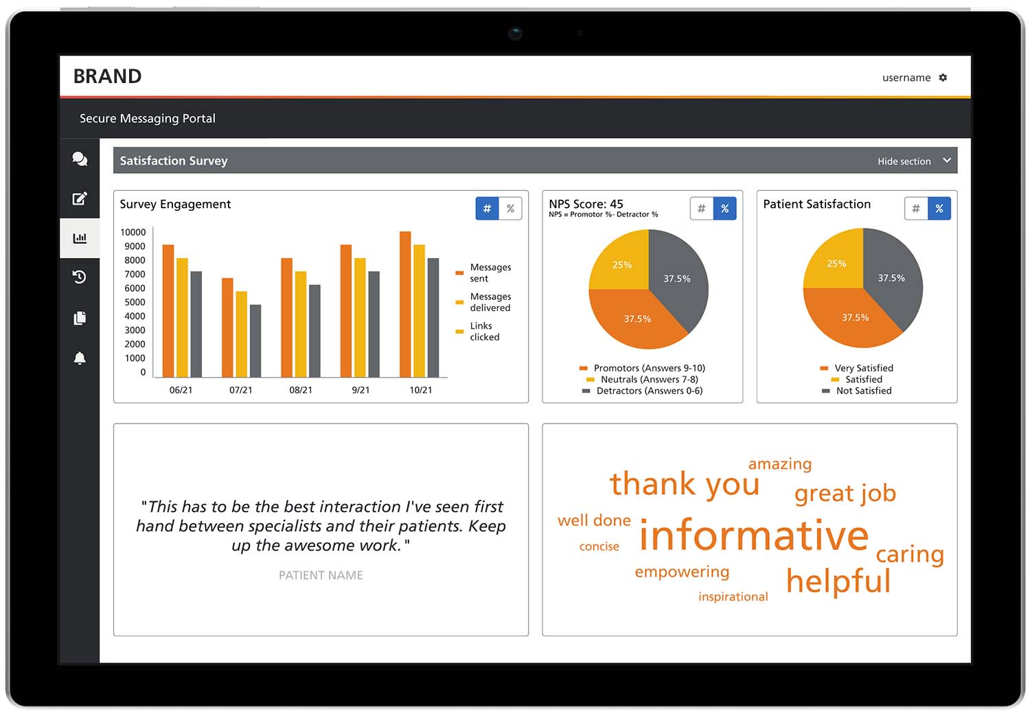
Next, I researched best practices and trends for dashboards. Then I narrowed down which data visualizations were most important to display prominently.
Our developers were working under some time constraints, so the first release would have to be simple and streamlined. In order to accomplish this, I decided to use Telerik components as the base code for the dashboard widgets because it was a tool that our developers had already integrated into our software. I design the dashboard widgets in a way that kept development and UI modifications to a minimum.
Step 3
Ideate & Sketch
In order to determine the best way to visualize the data with the given constraints, I went back to reliable paper and pen to sketch some concepts.
Step 4
Design & Develop
Using Figma, I produced high fidelity mockups and wrote detailed specs on how each visualization should function.
Step 5
Measure
This dashboard tool was recently launched. The next step is to gather feedback from users to understand how well the dashboard is helping them to accomplish their goals.